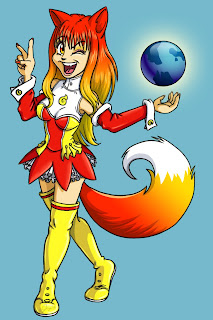
However, I am a professional artist. I often find myself working in Photoshop even though my job title is a Flash Animator. So I thought I would post a tutorial on how to make an anime character.
I love anime, but I find it sometimes to be quite monotonous. I like the face to have more personality and I love drawing curvy women, so my drawing style is not your typical tiny nosed, pointy chin, little mouth style. Actually, I'd like to think that I don't have a particular drawing style. I can emulate styles, but I don't want to limit myself to any of those. I can draw whatever I want and make it look like whatever style I am copying.
Ok on to the tutorial!
How to Make a Digital Drawing
BEFORE WE START:Open Photoshop, or an equivalent program that uses a layer system. Set your canvas or drawing area to a size you are comfortable with. I used 800 x 1200. Select the brush tool and set it to a hardness of 100%. Set it to whatever width you want your lines to be.
TIP: Get familiar with your tools! Make sure you use a normal brush, not the pencil. Scribble around first and find the right size.
LET US BEGIN:
I am assuming at this stage you know how to draw. If you don't then close Photoshop, get out a pencil and paper, and start taking lessons. You are not ready for this yet young grasshopper.
Start by making a rough sketch on a new layer
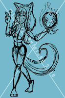 If you can't draw out of your head then find a model, use a mirror, or take a picture of a friend in the pose you want to draw. DO NOT trace or copy someone's drawing or a photo. I don't care if you took the photo, and it is of you. Don't do it. This will not help you become a better artist. If you are old enough to read and comprehend this then you are old enough to learn how to draw properly.
I'm not going to break down every step of properly drawing a figure, but as you can see I used a line of action, blocked in shapes, and used all those good construction principles that classically trained artists use. I didn't use a model this time. I used one drawing for leg reference, and I used my memory for the rest. Looking back the arms might be a bit too short, the pose might be a little unstable. I should have had someone else check this for me, but I was being lazy. This is the stage where you get second opinions and make changes. From here on out we are committed to this drawing.
Tighten up the line art
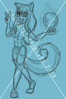
Time to clean up the sketch! Make a new layer for your line art(I make a new layer for each major body part's lines). Set the sketch layer's opacity to 50% or lower. On your new layer make sure your brush is set to a decent weight(amount of pixels also referred to as thickness) and begin tracing over your sketch.
I used a Wacom Cintiq which has a pressure sensitive pen, so my lines vary in weight. This is done purposefully.
Lines that are all in uniform weight tend to make the drawing look flat and dead. Anime and most animated cartoons don't vary their line weight usually(now-a-days). There are reasons for that, but for a still image having varying line weights really makes the artwork come to life. Of course you also have to know where to make the lines thinner and thicker. A general rule is that larger forms have thicker lines than smaller forms.
Hair is one mass made up of groups of pieces of hair. Treat it initially as one body part with an overall shape. Then start to divide it up into smaller shapes. Never draw each individual hair. I don't think any sane person has attempted this but you never know. The same could be said for tails. It is one shape. You can make a few pieces of fur "break off" from the form, but don't lose the underlying shape.
As you can see in the first image I have the arms and tightly fitting boots done but not the mid section...
Tighten up the line art 2: Add clothes
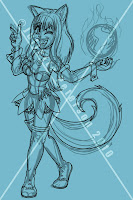
Time to dress your character! The reason why I drew the arms all the way to the shoulders is because when I go to draw clothing I want to make sure that the clothing fits around the shape or her body. If you get caught up in drawing wrinkles and fabric then you tend to forget about the underlying body parts and their actual shape. Unless your character is wearing spandex... ew. This image has the arms masked out for the sleeves and the clothing over them is on a separate layer.
This is very important. Make sure your clothing wraps around the form of the body. Even loose fitting clothing should follow this rule. Look at how materials work. they will bunch up and make creases at a bended joint. Gravity will act on clothes. Please consider gravity when you draw clothing.
Start coloring!
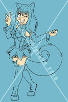
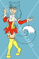
You've completed your line art and now it is time to add color. You can start with any part you'd like; I started coloring the face first on a new layer under the line art. Then I made a new layer and started coloring in the clothes.
Her outfit is normally red and yellow like this, but I suggest you look up some color theory and find a color scheme that you like. Pink and purple are perfectly good colors, but my eyes bleed every time I see them used in large amounts together. Consider using muted tones with brighter accents. I used to work for a toy company and they had it stuck in their heads that kids love fully saturated bright and neon colors. This is false.
Start coloring part 2: the hair
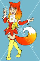
I made her hair like this because she is not my character and that is how her hair is. I think they are playing on the Firefox logo's fiery tail which is a gradient.
I suggest you make your characters hair a solid color and make it whatever color you'd like. For the tail I also used the same gradient but set to radial.
If you are interested in the gradient I will show you a bit of how that is done in Photoshop.
In your toolbar there should be an icon for the paint bucket. This is also a sub menu. Click and hold down to open the sub menu. Select the gradient tool (TIP: it looks like a gradient). Under the topmost menu in the left corner the gradient icon should be there next to a default black to white gradient. Double click that to open the gradients menu. Now you can make a custom gradient! When you are done on your canvas the first point you make is the left side of the gradient and the last point is the right. You click once in the spot you want to start the gradient and hold + drag over to where you would like the ending point.
To make her hair I selected the area first then I added the gradient. If you don't select an area first your gradient will fill the whole stage.
Shadows and highlights
Make a new layer for each layer of shadows and highlights. Here is the progression of my shadows and highlights. There are two layers of shadows for each color, and two layers of highlights for each color.

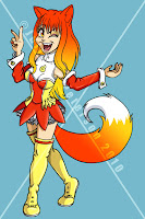
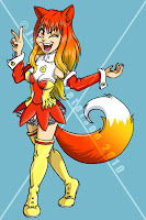
I am not going in to how I did each of these steps. For the shadows on the gradients I just colored black and lowered the opacity of the layer. For all other shadows and highlights I chose a color and painted it on a new layer.
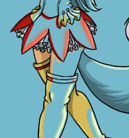
I wanted it to be anime-esk with the flat cell colored look, but I did also use the smudge tool to give it some softer highlights. I turned off the base colors layers to show you what just the highlights and shadows look like.
So why not use the burn and dodge tool? Because they are crap. There are many reasons why not to use those tools. Try it for yourself and find out why. Basically they aren't meant for the type of work that we are doing, and are harder to fix if you make mistakes. Just avoid them if you are making a drawing like this.
Finishing Touches
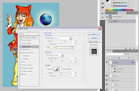 I wanted her to be holding the globe. So I went to Foxkeh's Blog and grabbed the globe png they have for free use. To make it look more like my drawing I added a stroke around it and a glow to make it stand out more. This was done with layer effects. This image shows what the menu looks like. You can select it by double clicking on the layer you wish to apply the effects to.
The finished image

I wanted it to be anime-esk with the flat cell colored look, but I did also use the smudge tool to give it some softer highlights. I turned off the base colors layers to show you what just the highlights and shadows look like.
So why not use the burn and dodge tool? Because they are crap. There are many reasons why not to use those tools. Try it for yourself and find out why. Basically they aren't meant for the type of work that we are doing, and are harder to fix if you make mistakes. Just avoid them if you are making a drawing like this.
Finishing Touches
 I wanted her to be holding the globe. So I went to Foxkeh's Blog and grabbed the globe png they have for free use. To make it look more like my drawing I added a stroke around it and a glow to make it stand out more. This was done with layer effects. This image shows what the menu looks like. You can select it by double clicking on the layer you wish to apply the effects to.
The finished image
